Plan Your Website - 8 Easy Steps
If you've been following along as I go through this series, I hope that you've gotten excited because now we're on to one of my favorite parts of getting your business online. It's time to Plan your Website! At this point you should have decided to bring your business online and purchased a unique and clever domain name that fits your brand. If you haven't, do those steps now before you start.
My 8 step process to plan your website
The purpose of this plan is to provide yourself a guide as you create your website or to have a plan to provide to a designer. This plan doesn't have to be perfect as it will evolve as you go. First things first, lets go over what we'll be covering today.
- Determine the content your website will contain
- Think about the assets you'll need
- Work out what features you MUST have
- Navigation
- Get inspired for your design
- Start with SEO Now
- That legal jargon
- Go Live
That's it, just 8 steps that'll define everything you need to build your website or have someone else design it for you. Without this plan, reaching out to a third party to design and build your website can be a disaster. And I don't say this blindly. After running two web development companies for over eight years, this was the most critical step that many businesses I've worked with had never even taken.
1. Determine the content your website will contain
Similar to whiteboarding, this step should be quick and include all the things about your business, what it will offer, and how you'll be educating your customer base. You should also think about the content you'll need to create, but again, don't get too bogged down here as it'll evolve over time.
Common content includes:
- Products / Services
- About your company
- Reviews
- Infographics
- Videos
- Updates
- News / Media
- Q & A
- Legal pages (example: privacy policy, disclaimers)
- How to articles / Guides
- Case Studies
- Testimonials
- Maps
- Contact methods
- Blog
This isn't a definitive list but should help provide some ideas on what content your website will contain. In the end, your website may contain thousands of pages. And if you're still lost, take a look at a few websites from your competitors to see what they're doing in your industry.
2. Think about the assets you'll need
It's your website, it's your brand! Now you'll need to determine the way your brand is going to be perceived. You may not need all of these items but you'll definitely be happy if you think about these items now so you can have them ready when you need them.
- Logo
- Brand Colors
- Brand Fonts
- Iconography
- Photography
- Illustrations
- eBooks
- White Papers
- Videos
- Testimonials / Reviews
- About Content
If you didn't know, your favorite brands have the top few of these are requirements set in stone, like the Brand Font. Did you know that that Black & Decker uses Avenir Black or that Calvin Klein & Mobil use Avant Garde Gothic? Though, Mobil uses the "Bold" version. So if there's a brand's font that you love, you can use it too! (Source: DigitalSynopsis)
3. Work out what features you MUST have
When we talk about the features that are a must-have on your website we're looking for two things. The features you'll want your visitors to be able to do and what things you'll want to have access to modify once your website is complete. Typically, features like SEO Settings, Social Share Icons and Testimonials or Reviews features everyone will want. Again, this won't be an exhaustive list but a great starting point.
- Newsletter Opt-In
- Social Media Feed
- Social Media Links
- Survey Forms
- Comment System
- Contact / Support System
- SEO Settings
- Site Search
- Social Share Icons
- Backup System
- Breadcrumb Sub-Navigation
- Featured Product / Services
- Google Maps Widget
- Ad Management System
- Testimonials
- Scheduling System
- Image Pop-Outs
4. Navigation
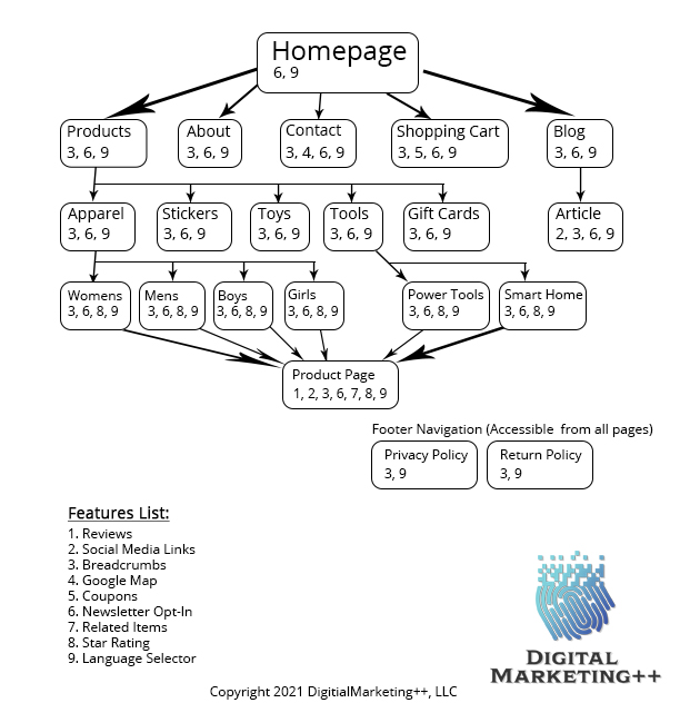
Now you'll need piece of paper for this one, or you can continue to use your whiteboard if you have space. Your website's navigation is going to define how people move around your website from page to page. From step 1 we have a list of the content you'll be including and from step 3 we have a list of features that'll be included throughout the website. We're going to use both of these here and draw out a diagram that maps the navigation for your website.
Drawing the diagram
- At the top of the page, go ahead and write "Homepage". This'll be the first page many people see and the one that pulls up at the root of your website, like www.ColoraodCarpetCleaners.com.
- Next, we'll go down the page an inch or so and list the other main pages of your website like About, Contact, Products / Services, Reviews, Q & A, Blog. If your website will only have a few categories, listing them instead of Products will work out better. I'll cover why in the SEO section below.
- Now, we'll go down the page again another inch or two and list the pages that'll fall under the list of main pages. Many of the items from the last step may not have additional pages. If there is one that has many sub pages, we'll end up putting those in what's known as a drop-down menu. Some of these items may even have sub pages of their own and if that's the case, feel free to list those now moving down the page.
- Next, there are certain pages that should be available throughout your website but don't need to be in your top navigation bar. These being your privacy policy, terms, and any disclaimer pages. These pages would go in what's known as the footer navigation, and we'll list them at the bottom of our list of pages.
- Lastly, the reason we left room below each page, we're going to add the features from step 3 to each page. Sometimes it's easier if you list all of these with a number and just reference the number instead of listing every feature by name. You'll want to add lines that connect the parent page to the child pages so its clear how you expect the user flow to go.
Example
Your ending diagram might look something like the below image. This isn't an end all diagram but one I created out of thin air for a company that sells tangible objects. If this is something you need help with, like I said above, it's one of my favorite things to do, contact us and we can set up a meeting to go over it.
5. Get inspired for your design
This is where things get "pretty". If you have no design sense, don't worry, there's a much easier way to determine how your website is going to look. There are a few things you want to make sure your design revolves around.
- It's easy to read on desktop and mobile devices
- It uses good white space to separate elements
- It includes an easy-to-use navigation menu
- Use images and video, not just text
- Keep the most important information at the top
Its easy to read on desktop and mobile devices
What you're looking for here is a mobile-first responsive website. Being that over 50% of the time spent online in the US is on mobile devices. And 50% of B2B inquires are made on mobile, it's increasingly more important to focus on a mobile first strategy. Once your site has been designed for mobile, it's actually pretty easy to scale it up to desktop and even add in additional items you would hide on mobile. (Source: TechJury.net)
It uses good white space to separate elements
Not only is this important for readability, but using good white space is even more important on mobile when things could get bunched together. If things are too close together they can be hard to click on. If a user gets frustrated trying to click around on your site they're likely to leave and find one that is better designed.
It includes an easy to use navigation menu
The navigation menu is one of the most critical items to get correct on your website because it's how people will get around. Don't go too wild with thousands of options in the menu but instead group items where they can and try to stick to 5-7 links max in your main navigation.
Use images and video, not just text
Remember the saying, a picture is worth a thousand words? Often times you can leverage an image to convey a complex idea. Other times, having a relevant image on the page can help to break up the page. Both of these help the user viewing the page have a better experience. Images can also be used to help the user navigate from page to page, many times with a small blurb about the page with the image. The use of images works in your favor, as our brains process visual information 60,000 times better. People also remember 80% of what they see, compared to 20% of text. (Source: Pixelo.net)
Keep the most important information at the top
The last thing to keep in mind for your design is to make sure that the most important information on each page is kept at the top of the page. More specifically were looking to keep the main body content above the fold, or the area of the page before you scroll down. Starting with a mobile first design will make this easier. For example, if working with the product page, just under your header and navigation should be your main body. The main body will include: the name of the product, pictures and/or video of the product, optionally a star rating, the price, any selection options for the product, with the quantity and an "add to cart" button.

These are the most important things to a mobile user. When the design expands to a desktop, there will be more than enough room to add your well-worded description to handle the needs of the desktop user. On mobile, this description would fall just under the main body. The mobile user is already comfortable scrolling down for this type of information if they need it to make their decision. Additional items like sponsored or related products can be kept further down as they aren't nearly as important. This also includes things like feedback and review forms, compare fields, detailed information and Q and A sections.
6. Start with SEO Now
While it may be tempting to leave doing your SEO until after you've added your products or services and content, you shouldn't. If you set up rules now on how each page will be named, how you will title them and the keywords that you'll focus on, it'll make generating these pieces of information faster and easier as you create the content. This'll ensure that you're creating the correct content, laying out and naming your pages correctly. SEO isn't a "band-aid" you stick on after a website is complete, it's fundamental to your success. I'll be covering SEO in much more detail in the weeks to come, but know that setting up SEO correctly will help fuel your paid, social, and other inbound marketing efforts.
7. That legal jargon
All websites collect customer information. Or at least you should be, as it allows you to customize your content and retarget visitors after they've visited you once. With things like the GDPR in the European Union and the CCPA in California, it's important to make sure you're in compliance. Generally speaking, you should also have a privacy policy on your website, a terms of use or conditions, as well as items like your return policy and shipping policy. This will insure consumer confidence in your company so they feel safe and are willing to work with or purchase from you.
8. Go Live
This is the time to schedule a launch party or event to kick off your business getting online. You can offer discounts, do giveaways, and even throw a dinner party, inviting possible clients, past clients, and business associates that would talk up your business. Having this scheduled will help ensure that your website gets produced on time. Getting it produced is another topic altogether, and we'll be going over that next week.
As always, I'm the Social Media Mentalist and if you have any questions about this plan or any other part of getting your business online, please don't hesitate to reach out .
 Pinterest
 Twitter
 Facebook